
E-commerce, Packshot Photography, Style Guides
Why a style guide and consistent product photos for your website are essential
Best practices to maintain consistency when creating product photos for your website
If you are reading this article you are most likely on a journey of getting good product photos for a website or are in the process of “stepping up your game.” Ecommerce retailing is done best when you establish a style and consistency and here is a best-practice checklist for you to consider.
Make your brand recognisable
Customers are constantly bombarded with information and retailers vying for their attending. To break through constantly having to reengage customers with you brand it’s important to have a recognisable identity that the customer gets to know as your brand. Having consistent imagery helps build a complete concept in a customer’s perception.
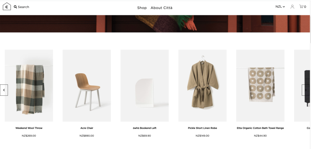
Citta provides a perfect example of having a consistency to their photography and brand that helps them achieve strong recognition with customers.
Easy navigation
Customers need wayfinding and navigation cues on your ecommerce stores, just as they do in a physical store. Consistent images help them surf through the pages with less friction. For example, category pages may be bright or include models, while product pages may have similar backgrounds, angles, numbers of images and video.
Keep it simple and engaging
Visually we look for imagery that creates calm and ease. The last thing you want is for your images to create a visual smash of a store.
For example, imagine you have a row of shoes, where some of them are shot at an angle, some from the top down, others have a blue background, others a yellow and the image size is inconsistent.
It is incredibly likely a customer will leave the store out of the uncomfortable feeling of looking at a mess. When we create visual chaos, all those inconsistencies distract your potential shopper from becoming a buyer. The inconsistency is the literally the handbrake to conversion.
Google algorithms require respect
Google are pretty good at their craft (just saying) and they know a lot of things about what a shoppers wants, so they have some rules for ecommerce and SEO best practices. You’d be a little silly to ignore these rules which would provide an obstacle to organic traffic.
The key guidelines include: being consistent in how you are naming your images, choosing file types, size and dimensions that you consistently deliver on. These are essential for your brand style guide.
It’s never too late to start
Often there is a catalyst which makes you need to sort out your photography consistency and the style guide such as, changing how you photograph your products (eg. outsourcing rather than DIY), starting a new ecommerce business or changing how your brand looks and feels, or having to provide product images to stockists, marketplaces or for PR requests. Whatever the catalyst, the main things is to take a step forward.
Style guide: a must-have before shooting product photos for website
Creating a detailed style guide is your main pre-requirement for ensuring consistency when it comes to a visual representation of products in an online store.

These are the vital parameters to define, document, file, and communicate to all involved.
What product image size is right for your website
This might seem like a minor task, but picking the right size for your website photography is a mission. Many marketplaces need smaller-sized images so they load quickly and don’t consume the anyway huge server space.
Other factors that may impact your requirements for the image size are a hosting package, the number of items on the page, hover-effects within the website that you choose [for example a magnifying effect may demand a bigger resolution], and sometimes, even the choice of theme impacts the size.
Most of the drag and drop ecommerce website builders, like Wix and Shopify, will specify the recommended size and will resize the image themselves so that the mobile version gets a smaller version, etc.
As the default setting, best practice suggests using 1600px images, or there abouts. This size maintains a great balance between keeping your website lightweight and having great quality to showcase your product.
Background type
Marketplaces like Amazon will ensure consistency across their sites by instilling a rule to only provide pics shot against a white background or clear cut. This allows the customer to focus on the product itself.
White and black are probably the most widely chosen colours for product photography backgrounds for the same very reason. Light grey hues such as F5F5F5 is a classy choice too when white seems too bright.
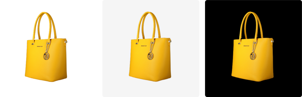
The main thing is to make a decision and stick to it. How you want your style to be perceived is important in this choice. But people are here to search for a product to buy.
Does it mean that you have no right to experiment? Not quite. You may use a different style for a category page, a hover effect or to POP some new item or new news. However, the same background should be used for all of the products lined up on the website page with rows of items displayed.
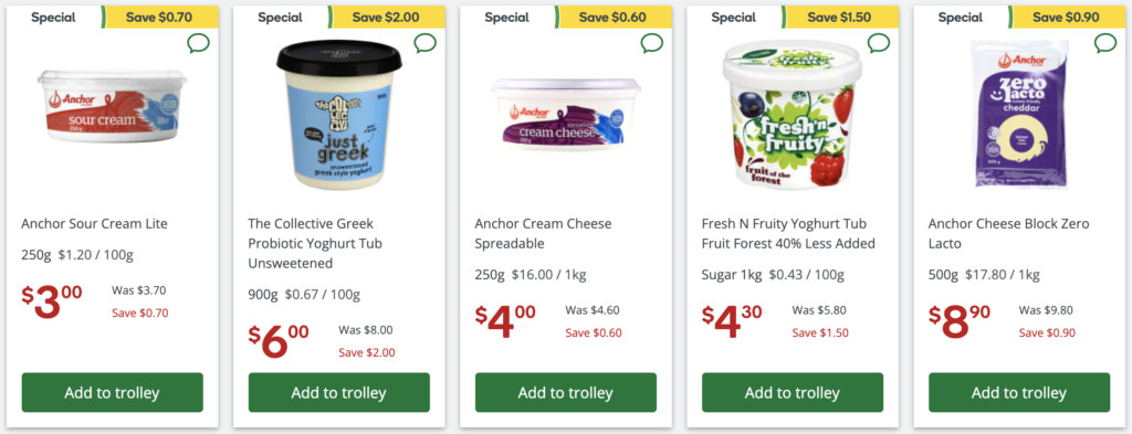
In this examples from Countdown, you can see the different tools used to help a message pop – but off a base of consistency. However one could question the image size consistency!
Drop Shadow / No Shadow
Choosing between having a drop shadow or no shadow photography is a personal preference with minimal impact. The best advice on how to find out what you like is to experiment and check out a few of your products in both versions: with and without shadows. Also check out other websites you admire who have what you feel is a similar style aesthetic.

Lighting
Lighting is the most difficult to replicate yet it gives the most consistent feel to a series of images. Keeping consistent lighting from year to year and shoot to shoot is made super easy by POP. It’s no longer hard as once you determine the style for your brand, the technology that drives our automated photography stores the setting for each and every shoot no matter what the product of category. That means you don’t have to worry about a thing – it will be consistent every time.
Determine your margins for every product type
The amount of negative space around your product also plays an important role in your consistency. If you are not sure if you like your product to take 77%, 80% or 85% of the screen, play around with options to see what’s right for you. Even place them in rows, like in an online store to work out what’s right for your brand.

NB: It’s not a defined parameter you can choose for all of your products for example, shoes, books and homewares. You will need to be specified for each product category individually. This is something the team at POP can assist you on if you are unsure.
Angles
Angles, and product positioning define your style and totally belong to a product photography style guide. Front, back, from atop, from below, at a ¾ angle, etc.
Shoes are the most whimsy with Nike setting high standards with lots of close-ups, angles, 360-degree images. The Kathryn Wilson screenshot below demonstrates perfectly the consistency of product shot and the typical angles a shopper would want to see of the product before purchasing.
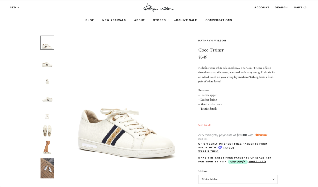
Close-ups are vital as they help bridge the gap between the online and offline sale experience. People cannot touch and feel the item, yet they can see it in the detail, which is almost tangible. This is incredibly important if you want to reduce returns and support higher priced items (reduce the risk of the shopper being unsure) and they are an expectation in the premium segment.
If you are unsure, POP can provide a consulting service to help you work through what is right for your brand. All our team have been in retail for years and have developed brand style guides for retailers in many categories right across new Zealand.
Quick tips
- Define and compile a style guide. Keep a separate set of requirements for different product categories.
- Share it with your team and photography partner, keep it updated and stored for all to access the most updated version any time.
- Choose POP as your photography partner. Our advanced automated photography studio enables your product images to be consistent, high quality and just as you have requested, each and every time. What’s more is we make it easy and cost effective for you to keep you website, clean, consistent and highly shoppable.
Reach out to our POP team as we’d love to have a chance to help your brand create a unique style that is high desirable and shoppable.
Learn more: Comprehensive Guide to Male Enhancement Products