E-commerce, Packshot Photography
How to increase your ecommerce conversion rate
30 July 2022
Author: Orbitvu
Measuring conversion rate as a way to recognise the health of an online store has not gone away over the years, even as we discovered how different the results are across various industries. Did you know that an average ecommerce store with arts & crafts products can have three times the conversion rate of one with baby & child accessories? And that the difference goes down to twice between cars & motorcycling and pet care? How does it refer to your industry? We write to help you with increasing conversion rate and to find the devil in the stats.
Your first step as an online store owner is to realise what conversion rate actually stands for. Finding benchmarks for your industry, as difficult as this may seem, will be next on the way to identifying many factors that influence your ecommerce site. Studies by IRP Commerce, Statista and Wolfgang Digital will be really helpful (1). Finally, in the recommendations stage, you can find out the things you can do to skyrocket above average conversion rates. We have proven advice for you, and some of it sits in product photography. Read on to discover ways to boost your ecommerce business.
What is conversion rate?
Put simply, conversion rate of an ecommerce store is the number of sessions with product purchased divided by the total number of sessions.

Measuring sessions rather than unique visitors is more efficient, as “sessions” serve better to illustrate single purchase intents. One visitor can make one transaction but they can as well log in several times in 30 minute intervals to buy more products. This will be effectively captured by your sessions-focused analytics system.
This, however, does not mean that the number of unique website visitors is not a helpful statistic. It will do well to let you know the range of your ecommerce websites and build a profile of your customer base with the useful metric of customer acquisition cost (CAC).
Conversion rate benchmarks
Taken with a pinch of salt, conversion rate data can serve you to measure the effectiveness of your marketing strategies. To know whether you are doing well, it is useful to have an idea of a good ecommerce conversion rate.
Below, the graph presents some of average conversion rates across different industries. It will be reasonable to use precise benchmarks rather than compare conversion rates across different verticals.
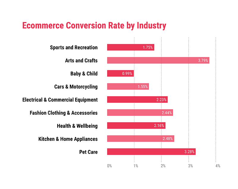
Do you have guesses as to why certain industries fly high with their CVR data, while others, with different product categories, are left with lower numbers? Think of emotions as the key.
Attractive visuals will evoke emotions and these are first impulses in a purchase decision. Art and pets with more than 3% CVR are highly emotional, as is health & wellbeing (1). The latter industry is additionally boosted by reason – who would not THINK the way to stay healthy?
Why is the way to conversion like a funnel?
To imagine the conversion process carefully, you can use the metaphor of a funnel. It is wider at the top, where all your websites sessions gather, and narrower at the bottom, where you count sessions with a purchase.
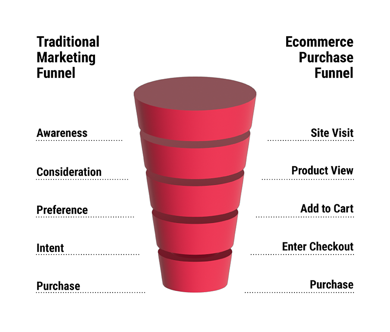
Reason and emotions both play a role in shaping your funnel, i.e. the customer journey. Customers progress on a way from developing interest in a product category, through gathering information, to defining favourites. In the last phase, they usually search for opinions and analyse the features of the product. Informativeness and visuals engage the client all along this way, where certain stages can be omitted or repeated.
Each stage involves less and less customers, as some of them resign on the way while others defect to the funnels of the competition. You will have different numbers of those who express interest in your brand, those who visit product pages, and those who add a product to the cart. Your task is to propel them all to the next stage and channel to the exit, which is the purchase.
The final aim of building a conversion funnel is the purchase. You will apply different persuasion techniques, of which visual content is among the most efficient. To include photos and videos that convert, read on to our final heading and drop by at the article dedicated to reducing returns rate in e-commerce.
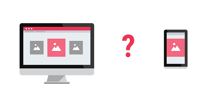
While building a conversion funnel, do not forget to gather precise data about your customers, such as the traffic source device, the operating system, and the source of interest (social media, Google search?). Google Analytics will be of immense help here. You will quickly realise that customers on mobile devices have different habits than those viewing on a desktop computer. We wrote extensively about image optimisation for all devices in our recent blog article.
From average conversion rate to the sky – what is the way?
Taking full control and ownership of your ecommerce business will require some optimisation work, if you want to chase other online retailers as to CVR. A good conversion rate is not beyond your reach, as long as you have processes in place that allow you to control SEM, SEO and UX. A visual content production process will also be key to good ecommerce marketing and a high CVR.
SEM is one way
Point-blank marketing campaigns executed via search engines can work effectively to impact conversion rate positively. Right keywords, good headings and descriptions in the search network or attractive graphics in the display network will awaken interest and play with instant emotions to drive your potential customers to the purchase. Mastering Google Ads seems a key starting point on the way to a higher conversion rate.
SEO goes along
At the same time, it will be important to keep your ecommerce websites in good shape for positioning in search engines. Search Engine Optimisation can save you SEM money and help you to reach customers in niches previously unthought of. Improving conversion rates starts at the top of the funnel, by building brand awareness.
The more people are even remotely interested, the more will end up at the bottom of the funnel going for a transaction. Ecommerce businesses that feature high in search engine results will automatically get a bonus at all initial stages of the customer journey.
Don’t forget about UX!
The virtual experience of the product is what differentiates ecommerce businesses from brick and mortar stores. A well-designed supermarket has all its shelves and alleys carefully planned for purchase maximisation. So should your ecommerce website.
Build your landing pages and product pages so that the user stays informed and still spends plenty of time on your website. Intuitive and attractive design based on professional UX advice helps with conversion optimisation, as even cosmetic changes in the interface can cause customers to modify their habits. A point to keep in mind.
Better sale conditions
If you offer free shipping and align your product range with the seasons, chances are your customers will be more willing to buy. Make it manifest with sales communication that you care for the customer in their daily needs and not hang out there only for their money. E.g. an offer for accessories at a reduced price will work to keep the customer interested. On the contrary, bikes in winter or books with delivery cost equalling the price will certainly not boost your conversion rates.
Make a change – quality visual content
Working for higher conversion rate can start with SEM, SEO, UX, and sales conditions but nothing will influence the emotions of your customer as strongly as quality visual content. You should take care to arm your e-shop with good packshots, informative 360-degree spins, and dynamic product videos.
Repeatability across the offer range
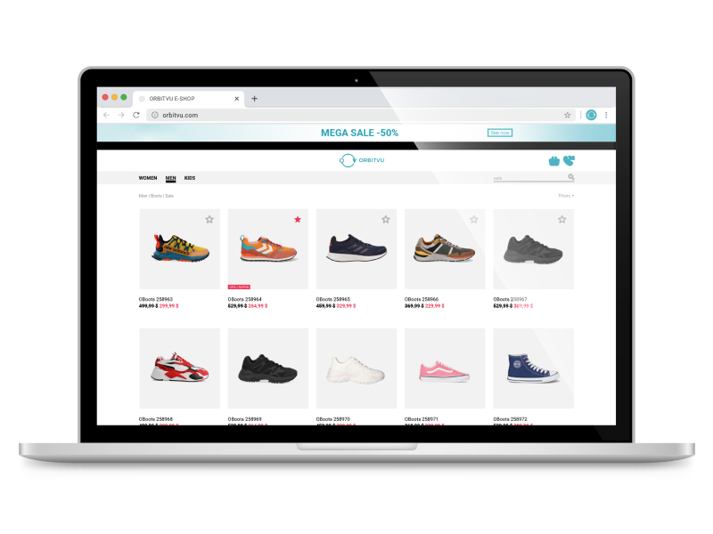
The general impression your ecommerce website makes depends highly on the coherence of its elements. Expect conversion rates to rise when all your product miniatures in grids will be of the same size and the colour palette will not spin from blue to red in every one photo.
Try to create visual information that is coherent across product ranges – repeat similar angles, zoom levels and colour palettes. Have you ever seen an Instagram profile that instantly draws attention and makes you scroll through all their photos distributing likes generously? It’s usually right because of repeatability and coherence. A little forethought in this area will pay off in brand recognition and shorter sales funnels.
Colours and light are powerful!
Anthropology has long proven that colours have deep influence on human perception and, in consequence, on actions. Reds help with alarming and drawing attention, yellows create a light atmosphere of joy, while greens work calmingly and assuringly. Colour warmth and light colour temperature will have a say in how much we desire to buy a product and how strongly we bond with the brand.
Knowing the basics of culturally differentiated colour science (try Evans Gavin’s “The Story of Colour” for a primer) can be your secret weapon in the climb for higher conversion rate.

Steer the visitor’s attention
Good graphics are a perfect UX tool that allows you to steer the visitor’s attention to the desired action. An average order starts with a catchy shot or a promotional offer on a shiny new product and the commercial success of a user’s path will also depend on how their purchase intent is boosted through intuitive progress on the website.
From spotting to payment, you can stuff the customer journey with fun videos and useful infographics. Play with reason and emotions in turns and the path to conversion will shorten.
Rich content is the way
Rich content means 360-degree spins and product experience videos. There is a significant setback to trying to sell an advanced touring backpack with only two or three packshots. Allow your customer to peek inside the pockets, swirl the item in all possible directions, and compare it with human models for size impression.
Including rich content will keep your customer in the conversion funnel and through information propel them to next stages. When executed well, it will offer near natural experience and reduce the chance of a product return. Keep in mind that all your conversions will not count, if they end up increasing your logistics costs by being yet another return!
Producing quality content takes a significant amount of time. In your quest for budget balancing and reasonable schedules, the time spans devoted to visuals can seem a burden. You may choose to outsource or employ more. Whichever way you choose, it will be costly. This is where photography automation steps in with a single investment that will lead straight to quicker and better visual content.
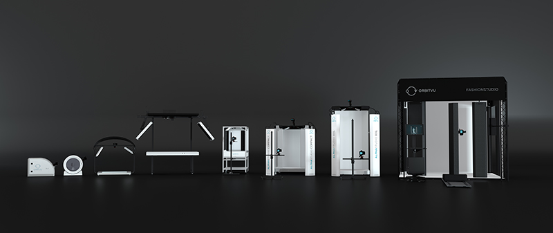
Automated studios, like Orbitvu’s Alphashot series, have been designed for product photography. They offer full control of lighting, one click background removal, and instant online publishing plugins.
Considering automation in visual content production as a way to better conversion rate (and savings!) seems to offer benefits beyond the face value. A quicker and more advanced photography process will let you keep the know-how within the company and give you a hand at all the described bonuses that visual content brings to conversion rates.
Summary
No matter if you are just beginning with marketing campaigns or playing with website UX to improve ecommerce conversion rates, it should now be clear to you that the job with conversion rate depends highly on the industry you are in.
The construction of your sales funnel is another factor that will heavily influence how many customers decide to buy your products online. Help them with creative visuals to progress from interest to purchase decision and do not let them abandon your shop due to fussy website construction or too aggressive campaigning.
We have described several ways to conversion rate optimisation and divided them into categories such as SEM, SEO, UX, and sales techniques. The final, and surely not the least, category is visual content quality. With small changes to your visuals and investments in the product photography processes you can influence conversion rates in a relatively straightforward way.
Remember about light, colour, rich content and repeatability. This way, you play with the strongest player in your customer’s head: their emotions. Gain an upper hand in this game and increase chances of buying online rather than “just watching what’s on offer”.
Whether you decide to employ automation in visual content production or dedicate more attention to SEM, your ecommerce site will have to depend on what the customer sees. We wish you that this one factor will play well for you and that you soon reach the conversion rate levels of arts & crafts…
Stay tuned!
(1) Ecommerce conversion rate statistics from growcode.com
This article is written by Orbitvu, world leaders in product photography automation and the incredible machines that power our POP studio.
Related post: Comprehensive Guide to Male Enhancement Products

