Packshot Photography
9 mistakes to avoid in product photography
18 October 2022
Author: Orbitvu
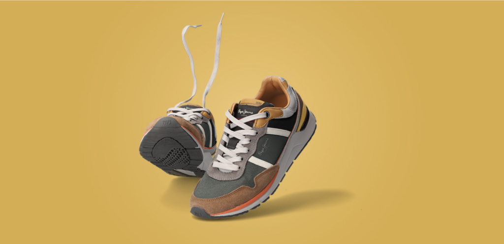
Product photography has clear tasks to perform. Entice, convince, and trigger the purchase decision. No matter what you’re selling, product photos help customers “window shop,” and learn more about your products before they make a purchase.
Consider this, 75% of online shoppers rely on a product photo to make a decision and 22% of returns occur because the product looks different in person.
So how can you make sure you sure you take great product photos that help increase your conversion rates? By avoiding these common mistakes below.
1) Unprepared product

Product photography exposes every detail of the product. This “risk of precise presentation” is the reason why preparing a product carefully is so important. Take care to remove lint or dust from the product and avoid leaving fingerprints.
- for a glossy surface product – use a microfiber cloth to clean the surface and put on white cloth gloves to position the product.
- for surfaces where dust might be visible – use compressed air from a manual or spray compressor to blow the dust off the surface.
- for clothes – spend the needed time with an iron to remove any creases or stains.
- for atypical products – sometimes products might look better when they are stuffed or presented on mannequins (mainly clothes). Do not hesitate to use these external aids. Think of a backpack that is more attractive when full than in flat lay photography.
2) Wrong shape of the product


The best way to present the shape of a product in full extension is 360 degree photography or producing a flat looking series of packshots.
A customer, being able to see all the angles of a product, will be more willing to make a purchase decision. After the delivery, there is also less chance of disappointing them at parcel unpacking.
3) Unfaithful texture of the product

In ecommerce it is key to offer the customer a quasi-real life experience of the product. Aim at presenting the texture faithfully and attractively. Failing to do so is often a mistake we encounter in online shops. What are the ingredients of a good texture presentation and a quasi-sensory experience of the product?
- Expose the irregularities of the surface. This matters for strangely shaped products as well as items where the 3D experience is key.
- Expose what the product is made of. Purchase decisions for clothes will often be taken based on the understanding of the material of the item. Make your photos show precisely that these trousers are made of corduroy or this dress is velvet.
4) Details rendered incorrectly
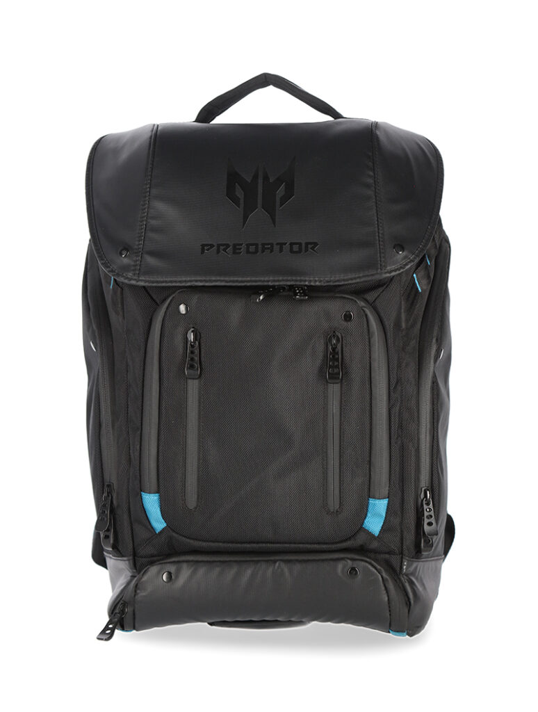


Rendering the texture of the product is just as important as attention to small features of the product. Items often have hidden features or elements that might be attached separately. They offer additional functionalities and change the possible uses of the product.
If a customer fails to observe some important parts of your product, they might turn to a different shop, where more care was given to all-around presentation. It is especially crucial in the times of growing ecommerce competition and consumer habits to rely on visual online presentations.
Take care to present all the switches, pockets and mini-functionalities of your product and devote separate photos to them.
5) Insufficient depth of field

Insufficient depth of field, f/2.8

Insufficient depth of field, f/2.8
Depth of field invites potential mistakes. If this parameter is not given full attention, some parts of the product in the photograph might come unsharp and blurred. This withholds plenty of information from the customer and might easily turn them away.
It is beneficial to take advantage of your camera settings to present the product in full sharpness.

No focus stacking
This is when the focus stacking technique applied in post-production will be helpful. You will need to juxtapose several photos with the focus on different parts of the field in photo editing software. A precise and time-consuming process but with Orbitvu’s automated photography solution, we can apply focus stacking at the photo production stage automatically and within seconds of machine processing.
6) Unfaithful colours

True colours

Unfaithful colours
Retouching is often used to make the image attractive, however keep in mind that you don’t overstep the boundary of realism.
Overly saturated colours, pumped up vibrance and contrasts are the most common examples of unfaithful colours.
This might mean using the sRGB colour space (web-recommended) and limiting the post-production effects. Otherwise, you might unwillingly convince the customer they are buying a different product and prepare yourself an additional return.
7) Reflections and shadows
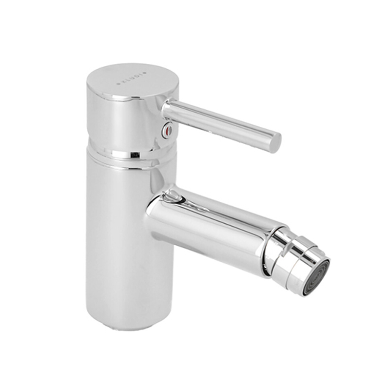
Shadow well managed

Shadows too visible
A different problem with lighting can come, when you get to managing shadows in the photograph. Too deep shadows produce an unnatural look and bring more associations with art photography. What’s more, they hide many details that would otherwise be visible on the product.
The way to deal with deep shadows is to allow the main light to reach the product from all angles or use directed lighting from additional lamps. With a little photographic experience, you can arrive at a good level of skill in light setup for different effects.

Shadows obscure details

Details well visible
Shadow and reflection details in the photo can be key for the customer’s choice of where to buy an item. A shop that presents its products with mistakes – too glossy or overburnt photo fragments, too deep shadows – will automatically cause their customers to move to a place where more professional product rendering is available.
8) Inconsistency of product photos across one platform

Incorrect cropping

Inconsistent backgrounds

Crisp and clean – all white backgrounds
Consistency in style and technique across one platform is key. Avoid a flurry of coloured backgrounds in photos as this can give the impression of disorder. A background standardised across one platform is recommended to reduce the bounce rate of customers in the shop and keep the viewers for interested in products for longer.
POP uses world-class technology that can automatically crop and remove background via templates. A manual approach for DIYer’s can also be implemented but consistency and repeatability standard should be clearly defined for post-production.
9) Irrelevant background in still life photos

Here, the background is more attractive than the product!

Is this a right set of products for a still life image?
When shooting still life, a mistake can occur already at the moment of choosing the background. Very often, in faulty still life shots, the background speaks more clearly than product or is completely irrelevant in colour.
Think carefully to pair the product with the background. An understated harmony will serve the product best – the background will softly and elegantly underline the features of the product or provide additional more remote associations. Wood as a background for food or steel for electric appliances may be a good example of how to approach the question of harmony.
It is equally important to choose the accompanying items with attention. They need not to steal the show from the product or offer too much contrast. The aim will be for them to be the support of a message rather than the focal point or irrelevant mess. What would you say, if you saw a kettle advertised in a shot together with a kitchen knife?
Final thoughts
Product photography can be overwhelming at times, especially if you are doing it yourself. At POP we are lucky to have Orbitvu’s technology to automate our content creation process to achieve quality, clear-cut photos and videos that meet all marketing and ecommerce standards.
If product photography is where you are falling short, we can help with that! Chat to our team of experts as we’d love to have a chance to help your brand create a unique style that is highly desirable and shoppable.
This article is written by Orbitvu, world leaders in product photography automation and the incredible machines that power our POP studio.
Check this: Comprehensive Guide to Male Enhancement Products

